I guess people post when they've updated their site design?
There are, of course, many things I want to change about this site. I know it's rude that I only have this dark purple theme 😉. Since I work on web code all day for my job, it's been nice to just have this site working and leave it as-is.
BUT I wanted to add some content-relevant changes for my essays. Here's what I added!
Figure Captions
The Kirby CMS makes it really easy to add captions to figures/images. I hadn't styled them, though, so they didn't look associated with the image. So, I added a simple style:

Wider Images
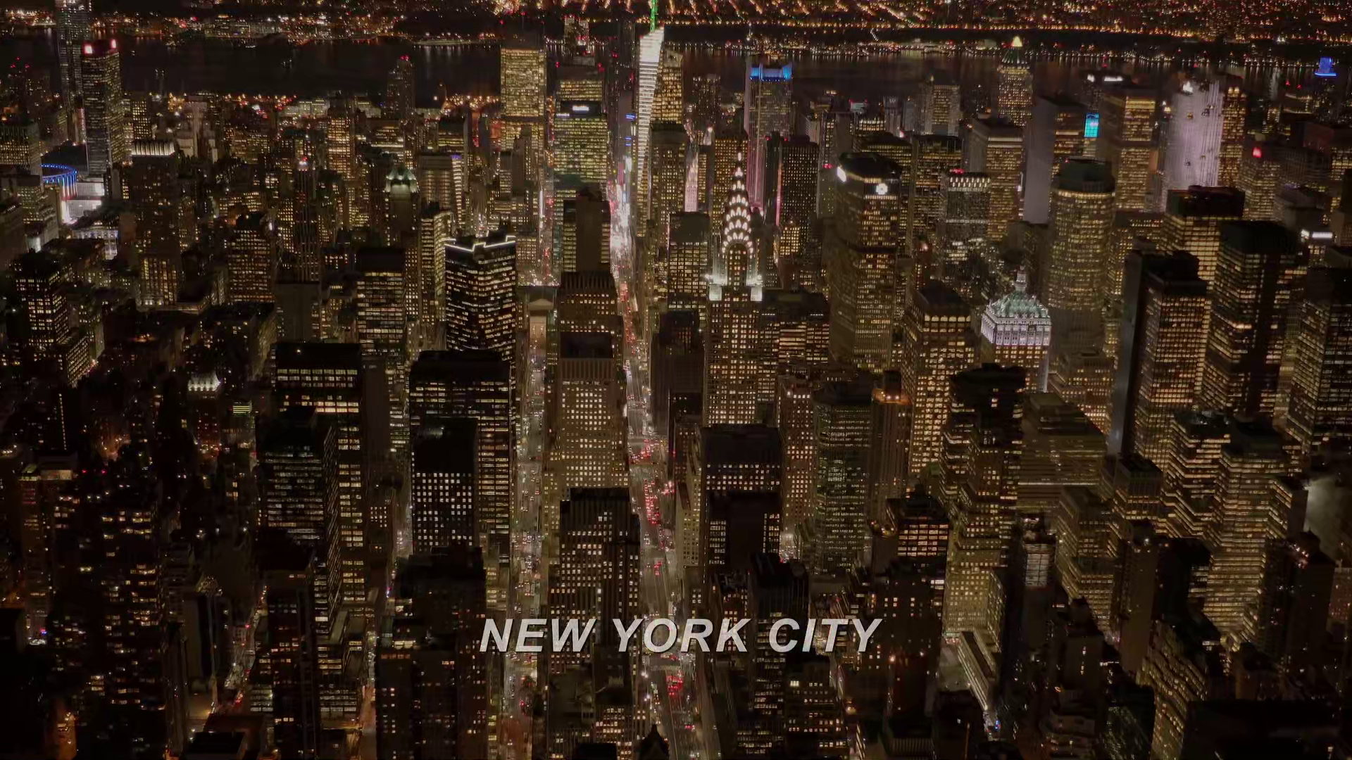
Since I'm using so many widescreen screenshots recently, I've wanted some of them to be wider. So, now they can be:

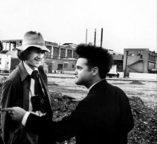
I am breaking the news of Itty Björk.
Inline Notes
This is what I'm most excited about! Y'all KNOW I love a footnote (House of Leaves from allway back), but weirdly, I don't love a website footnote where you gotta click a link, which jumps to the end of the page and back. It's fine, but usually feels uniquely-disorienting, versus glancing down a printed page.
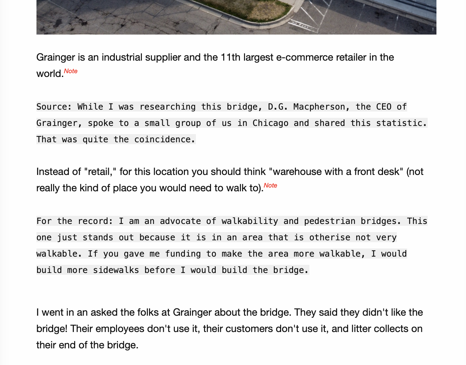
But some time back, I read this fantastic essay by Tyler Vigen about a weird bridge. I really recommend it!!!
He does something I really like, and have now implemented for myself. He adds little "note" links inline:

When you click them, they just add text inline:

I LOVE IT
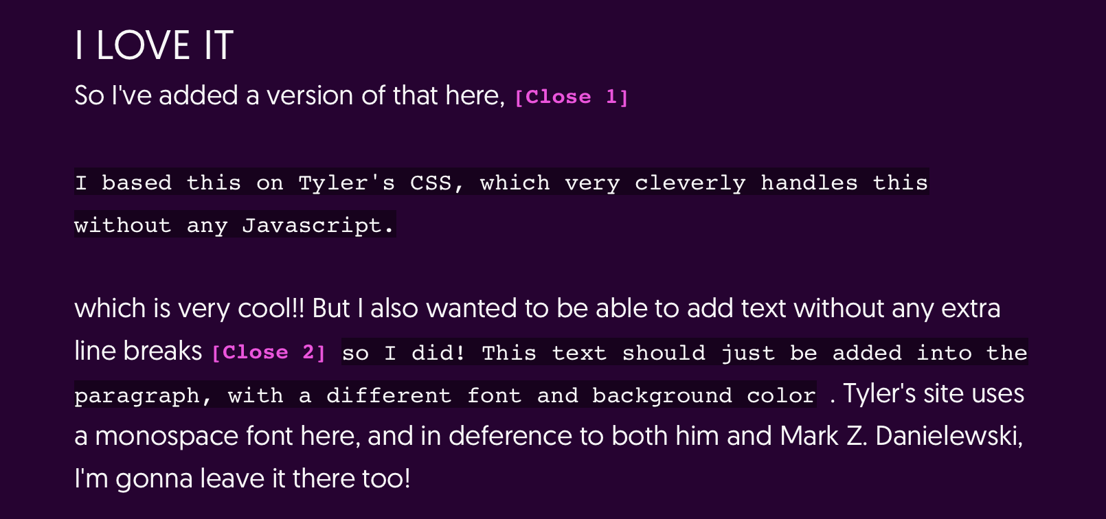
So I've added a version of that here,
I based this on Tyler's CSS, which very cleverly handles this without any Javascript.
which is very cool!! But I also wanted to be able to add text without any extra line breaks so I did! This text should just be added into the paragraph, with a different font and background color . Tyler's site uses a monospace font here, and in deference to both him and Mark Z. Danielewski, I'm gonna leave it there too!
This might not be the final version of this, but it's enough for now! I don't love the colors; I know it's a little bit hard on the eyes with the darker background. I'll probably play with the styles! I also want to be able to format the content more, but that'll probably be more involved. Here's a picture of the above notes expanded, for posterity!

To make this easy for me to use, I created a simple Kirby Plugin. Just to make this post MORE of a collage, and because I don't share my code often enough, here's the quick & dirty code!!!
<?php

Kirby::plugin('splendorr/note', [
  'tags' => [
    'note' => [
      'attr' => [
        'break',
      ],
      'html' => function($tag) {
        // Construct id! get first 10 characters of text
        $firstChars = mb_substr($tag->value, 0, 10);
        // Remove spaces
        $noSpaces = str_replace(' ', '', $firstChars);
        // add a pseudorandom int, just in case two notes start with the same characters
        $id = $noSpaces . rand(1,50000);

        if ($tag->break) {
            $wrap = '<br/><br/>';
        } else {
            $wrap = '';
        }

        /* You CAN add <br> tags inline  */
        return '<span class="inline-note"> <input type="checkbox" id="' . $id .  '"> <label for="' . $id .  '" title="' . $tag->value .  '"></label> <span>' . $wrap . $tag->value . $wrap . '</span> </span>';
      }
    ]
  ]
]);
I will probably do a pass through my Twin Peaks essays, move certain things into notes, and make the screenshots wider.
IS ADDING THESE FEATURES A SIGN OF PERSONAL GROWTH AND HEALTH? OR A "COULD A DEPRESSED PERSON DO THIS?" SCENARIO????
both :)